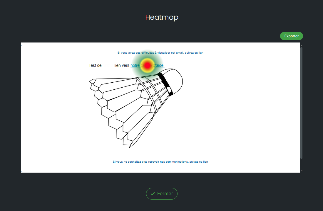
La Heatmap, ou “carte de chaleur”, vous permet d'identifier en un coup d'œil les zones les plus consultées de votre campagne e-mail. Grâce à une représentation visuelle des clics, vous pouvez analyser le comportement de vos destinataires et optimiser vos futures campagnes.
Après l'envoi de votre campagne, la Heatmap superpose les statistiques de clics directement sur votre e-mail. Chaque lien est mis en évidence selon son niveau d'interaction.
Vous pouvez ainsi :
Identifier les liens qui attirent le plus l'attention.
Repérer les zones peu ou pas cliquées.
Vérifier si vos appels à l'action (CTA) sont suffisamment visibles.
Comprendre le parcours de lecture de vos destinataires.
Optimiser le positionnement de vos contenus et boutons pour vos prochains envois.
La Heatmap s'appuie sur les clics enregistrés lors de votre campagne.
Chaque lien est coloré selon son niveau de performance :
🔴 Warm colors : links that received the most clicks.
🟡 Intermediate colors : moderately solicited links.
🔵 Cool colors : links that generated few or no clicks.
This visualization allows you to immediately identify the most performing elements of your email.
Imagine a newsletter containing:
a button "Discover what's new" at the top of the email;
a promotional banner in the middle;
several links in the footer.
The Heatmap shows that:
the primary button appears in red: it concentrates the majority of clicks;
the banner is in yellow: it generates moderate interest;
the footer links remain in blue: they are rarely used.
You can conclude that your primary call-to-action is effective, while secondary links would benefit from being repositioned or highlighted more prominently.
After sending your campaign, open the campaign Statistics, navigate to the "Links" tab and then click on the image on the right side of the screen. You will be able to view your email directly with the click zones highlighted.
Note that it is also possible to export your heatmap in JPEG format.
The Heatmap is particularly useful for comparing multiple campaigns, testing different locations for an action button, measuring the effectiveness of a new layout, or verifying that important information is well noticed.
For a more comprehensive analysis, it is recommended to cross-reference the Heatmap data with other campaign statistics (open rate, click-through rate, engagement, etc.).
