Today, the majority of users access content from their smartphones. To meet these new usage patterns, your campaigns are designed using a responsive approach.
This strategy improves user engagement while strengthening the overall effectiveness of your campaigns.
However, certain adaptations may not suit your preferences, especially depending on your phone's width, as well as its display version.
To address this, you can, from the design stage of your content, interact with the visual rendered on smartphone independently from that on mobile. We show you how below:
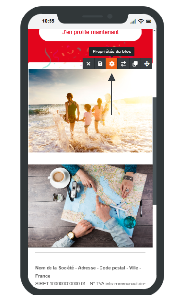
To verify the rendering of your page, use the preview switch located in the editor.
You can switch at any time between:
Desktop view
Mobile view
This feature allows you to quickly check the appearance of your content on different devices before publication.

If automatic adaptation does not exactly match your needs, from the mobile view, you can modify certain parameters directly in the block properties.
In the Display Rules tab, several options are available:
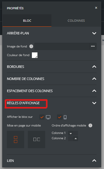
You can choose whether a block should be visible:
on desktop only;
on mobile only;
on both types of devices.
This option is particularly useful for displaying different content depending on the context of use.
When a block contains multiple columns, it is possible to define their display order on mobile.
For example, an image displayed on the left on a computer can be moved below the text on a smartphone to improve readability.
The builder also allows you to define how columns should behave on small screens:
preservation of column layout;
vertical stacking of elements;
reorganization adapted to screen size.
Systematically verify the rendering in mobile mode before publication.
Avoid overly crowded columns on smartphones.
Use display rules only when automatic adaptation does not meet your needs.
Favor a simple structure to ensure an optimal experience across all devices.
With these features, you maintain full control over the display of your pages while benefiting from automatic responsive adaptation.
When you duplicate an existing campaign or page, the responsive settings already configured are also copied.
This means that all modifications made specifically for mobile display (column order, block visibility/hiding, layout parameters, etc.) will remain active in the copy.
⚠ If the new campaign contains different content or structure, these settings may no longer be appropriate and may result in unexpected mobile display.
